Visual Timer started as a passion project inspired by Jake Knapp’s “Sprint” — a timer app emphasizing visual time representation to support focused, time-boxed tasks.
Key design decisions
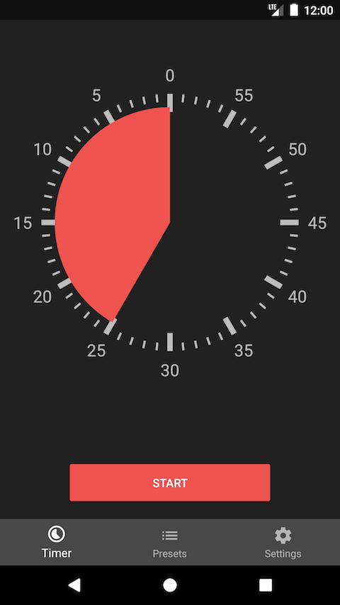
Circular visual representation. Displaying time as a circle segment works intuitively, even for users unfamiliar with traditional time concepts. Users set duration by tapping or swiping directly on the circle — no separate input dialogs.
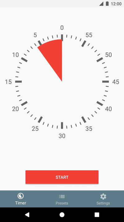
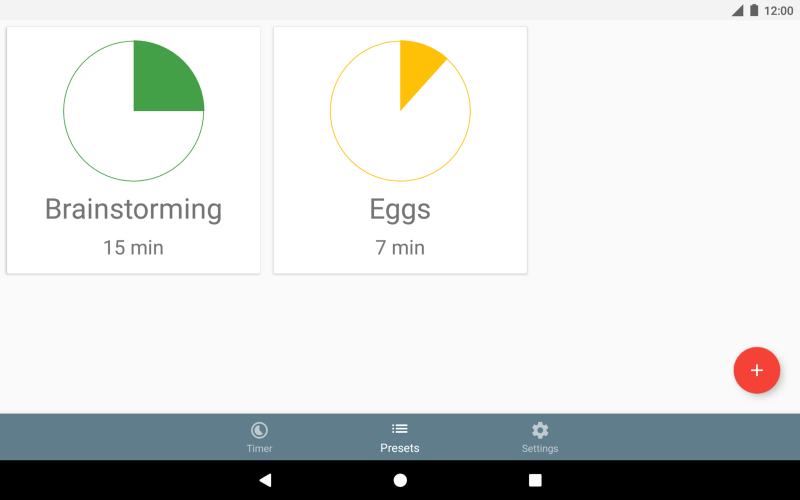
MVP features: timer setup in seconds or minutes (up to 60), screen-on during countdown, quick-access notifications, customizable alarms, and preset timers.
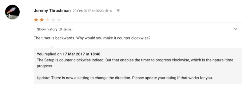
The clockwise debate
Early reviews revealed a wrong assumption — users expected clockwise timer progression. Rather than defending the counter-clockwise design, I added a direction setting while keeping counter-clockwise as default. Responsive iteration without blindly accepting every request.
Iterative improvements (28 updates in 16 months)
A dedicated feedback tool tracked feature requests and pain points:

- v1.2: Tablet optimization, smart preset ordering by usage frequency
- v1.3: Pause and resume — addressing a fundamental gap
- v1.4: Dark theme, app-level alarm volume control
- v1.5: Android app shortcuts and deep-linking
- v1.6: Landscape orientation support
- v1.6.3: Refined haptic feedback using Android’s system API
Growth
- 40,000 installs, 4.6-star rating (760 reviews)
- 12,400 monthly active users
- 28% of sessions use custom presets
- Nearly 100% organic growth
- Crowdsourced translations in 8 languages increased discoverability
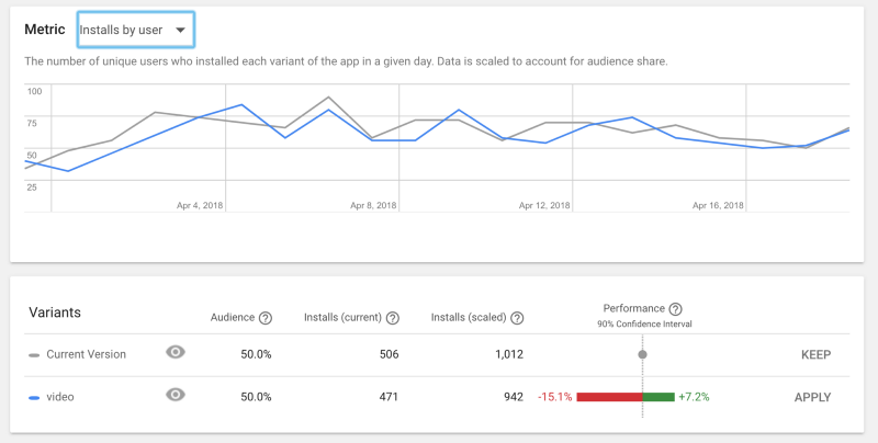
A/B testing: simplified icons outperformed conceptual designs by 17–35%.
![]()
![]()
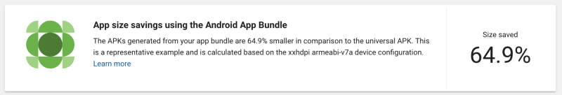
App Bundle could save up to 64% on install size:
Lessons
Genuine user-first design creates business value through organic growth. Listening to feedback requires nuance — distinguishing systemic problems (worth fixing) from feature requests (requiring deeper validation). Starting with an MVP and iterating based on actual behavior beats pre-launch perfection.